
Women in CS
@Technical university of munich
Redesign the website for a student club at the university to enhance user experience and increase event registrations
Role
UX/UI Designer
timeline
2024
skills
Web Design
UX Research
tools
Figma
background
Women in CS@TUM is a student organization at the Technical University of Munich that advocates for equal participation and support for women and underrepresented groups in computer science.
background
Women in CS@TUM is a student organization at the Technical University of Munich that advocates for equal participation and support for women and underrepresented groups in computer science.
background
Women in CS@TUM is a student organization at the Technical University of Munich that advocates for equal participation and support for women and underrepresented groups in computer science.
first impression
I began the process by discussing the project scope with the Women in CS@TUM team
From there, I conducted a heuristic evaluation to identify potential usability issues.
first impression
I began the process by discussing the project scope with the Women in CS@TUM team
From there, I conducted a heuristic evaluation to identify potential usability issues.
first impression
I began the process by discussing the project scope with the Women in CS@TUM team
From there, I conducted a heuristic evaluation to identify potential usability issues.
discovery
Main reasons users did not complete their journey on the website:
These are the issues I aim to solve with my redesign.
discovery
Main reasons users did not complete their journey on the website:
These are the issues I aim to solve with my redesign.
discovery
Main reasons users did not complete their journey on the website:
These are the issues I aim to solve with my redesign.
1.
Plain design aesthetic
Plain design aesthetic
Plain design aesthetic
Lacks visual elements to distinguish it from other student clubs
Lacks visual elements to distinguish it from other student clubs
Lacks visual elements to distinguish it from other student clubs
2.
Unclear navigation
Unclear navigation
Unclear navigation
no immediate access to events from other pages
no immediate access to events from other pages
no immediate access to events from other pages
3.
Limited communication
Limited communication
Limited communication
no easy way for interested students to engage with the club
no easy way for interested students to engage with the club
no easy way for interested students to engage with the club
visualizing the existing user experience
I created a user journey map to analyze user browsing behavior and identify opportunities for improvement
visualizing the existing user experience
I created a user journey map to analyze user browsing behavior and identify opportunities for improvement
visualizing the existing user experience
I created a user journey map to analyze user browsing behavior and identify opportunities for improvement

Then I designed a simple information architecture to streamline the site structure
Then I designed a simple information architecture to streamline the site structure
Then I designed a simple information architecture to streamline the site structure


wireframing
Since the original website is fairly straightforward, I simply designed dedicated pages for events and contact
This makes navigation more intuitive. I also improved the layout by structuring content more clearly, ensuring key information is easily accessible.
wireframing
Since the original website is fairly straightforward, I simply designed dedicated pages for events and contact
This makes navigation more intuitive. I also improved the layout by structuring content more clearly, ensuring key information is easily accessible.
wireframing
Since the original website is fairly straightforward, I simply designed dedicated pages for events and contact
This makes navigation more intuitive. I also improved the layout by structuring content more clearly, ensuring key information is easily accessible.
Style guide
I used purple as the primary color to make the design stand out
Women in CS @TUM wanted to communicate their brand identity through a distinct color palette. Purple was chosen for its association with creativity, empowerment, and inclusivity. Additionally, I kept the typography hierarchy simple to maintain clarity. This ensures a clean and readable structure throughout the website.


"I think showing upcoming events is enough”

"Don't feel like the past page is needed unless they offer it again in the future”

"I like the FAQ section”
"It helps me look up questions without bothering the team”
"In case you can’t find what you need, you can drop them a message”
"I think showing upcoming events is enough”
"Don't feel like the past page is needed unless they offer it again in the future”
"I like the FAQ section”
"It helps me look up questions without bothering the team”
"In case you can’t find what you need, you can drop them a message”
"I think showing upcoming events is enough”
"Don't feel like the past page is needed unless they offer it again in the future”
"I like the FAQ section”
"It helps me look up questions without bothering the team”
"In case you can’t find what you need, you can drop them a message”
"I think showing upcoming events is enough”
"Don't feel like the past page is needed unless they offer it again in the future”
"I like the FAQ section”
"It helps me look up questions without bothering the team”
"In case you can’t find what you need, you can drop them a message”
"I think showing upcoming events is enough”
"Don't feel like the past page is needed unless they offer it again in the future”
"I like the FAQ section”
"It helps me look up questions without bothering the team”
"In case you can’t find what you need, you can drop them a message”
"I think showing upcoming events is enough”
"Don't feel like the past page is needed unless they offer it again in the future”
"I like the FAQ section”
"It helps me look up questions without bothering the team”
"In case you can’t find what you need, you can drop them a message”
"I think showing upcoming events is enough”
"Don't feel like the past page is needed unless they offer it again in the future”
"I like the FAQ section”
"It helps me look up questions without bothering the team”
"In case you can’t find what you need, you can drop them a message”
"I think showing upcoming events is enough”
"Don't feel like the past page is needed unless they offer it again in the future”
"I like the FAQ section”
"It helps me look up questions without bothering the team”
"In case you can’t find what you need, you can drop them a message”
user feedback
I conducted usability testing with four users to get feedback on the first iteration
Overall, most users like the new website look. However, some suggested that explicitly displaying current and upcoming events would improve usability.
user feedback
I conducted usability testing with four users to get feedback on the first iteration
Overall, most users like the new website look. However, some suggested that explicitly displaying current and upcoming events would improve usability.
user feedback
I conducted usability testing with four users to get feedback on the first iteration
Overall, most users like the new website look. However, some suggested that explicitly displaying current and upcoming events would improve usability.
Incorporating user feedback
Based on the feedback I received, I removed the Past Events page and displayed only current and upcoming events
This enables users to quickly find relevant event information without unnecessary navigation
Incorporating user feedback
Based on the feedback I received, I removed the Past Events page and displayed only current and upcoming events
This enables users to quickly find relevant event information without unnecessary navigation
Incorporating user feedback
Based on the feedback I received, I removed the Past Events page and displayed only current and upcoming events
This enables users to quickly find relevant event information without unnecessary navigation
final prototype
Home page
I added Events to the navigation bar for easier access. I also reorganized events into rows of cards, improving readability and reducing excessive scrolling
final prototype
Home page
I added Events to the navigation bar for easier access. I also reorganized events into rows of cards, improving readability and reducing excessive scrolling
final prototype
Home page
I added Events to the navigation bar for easier access. I also reorganized events into rows of cards, improving readability and reducing excessive scrolling
About page
I merged About and Members into a single page. I then redesigned profile cards for a more visually appealing organization chart
About page
I merged About and Members into a single page. I then redesigned profile cards for a more visually appealing organization chart
About page
I merged About and Members into a single page. I then redesigned profile cards for a more visually appealing organization chart
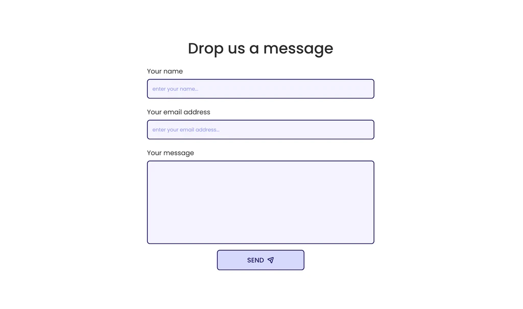
Contact page
I created a dedicated Contact page with an FAQ section. If users do not find their answers, they can reach out to the club via the contact form
Contact page
I created a dedicated Contact page with an FAQ section. If users do not find their answers, they can reach out to the club via the contact form
Contact page
I created a dedicated Contact page with an FAQ section. If users do not find their answers, they can reach out to the club via the contact form
Event page
I turned the Events section on the homepage into a standalone page. This allows users to have quick access from anywhere on the site
Event page
I turned the Events section on the homepage into a standalone page. This allows users to have quick access from anywhere on the site
Event page
I turned the Events section on the homepage into a standalone page. This allows users to have quick access from anywhere on the site
How This reDesign Adds Business Values...
By addressing key usability issues and enhancing visual appeal, the redesign encourages users to complete their journey on the website
This leads to higher engagement, increased event registrations, and more interested users converting into members
How This reDesign Adds Business Values...
By addressing key usability issues and enhancing visual appeal, the redesign encourages users to complete their journey on the website
This leads to higher engagement, increased event registrations, and more interested users converting into members
How This reDesign Adds Business Values...
By addressing key usability issues and enhancing visual appeal, the redesign encourages users to complete their journey on the website
This leads to higher engagement, increased event registrations, and more interested users converting into members
next steps
next steps
next steps
Conduct usability testing with real users to gather feedback for future iterations.
Track key metrics to measure the redesign’s effectiveness.
Analyze user behavior to identify areas for further refinement.
Optimize accessibility and responsiveness to streamline a seamless experience across all devices.


my other work
Check out how I helped muunai, an AI-powered medical documentation tool, elevate their web application
my other work
Check out how I helped muunai, an AI-powered medical documentation tool, elevate their web application
LET’S WORK TOGETHER?

2025 | Thy Nguyen · All rights reserved
LET’S WORK TOGETHER?
2025 | Thy Nguyen · All rights reserved
LET’S WORK TOGETHER?
2025 | Thy Nguyen · All rights reserved