muunai
AI-powered medical documentation
Redesigning a med-tech web application to streamline medical documentation workflows, reduce cognitive load for doctors, and improve onboarding for new users
Role
UX/UI Designer
Team size
3 Members
Timeline
Oct 24 — Jan 25
skills
UX Design
Design System
muunai
AI-powered medical documentation
Redesigning a med-tech web application to streamline medical documentation workflows, reduce cognitive load for doctors, and improve onboarding for new users
Role
UX/UI Designer
Team size
3 Members
Timeline
Oct 24 — Jan 25
skills
UX Design
Design System
muunai
AI-powered medical documentation
Redesigning a med-tech web application to streamline medical documentation workflows, reduce cognitive load for doctors, and improve onboarding for new users
Role
UX/UI Designer
Team size
3 Members
Timeline
Oct 24 — Jan 25
skills
UX Design
Design System
Introduction
muunai
muunai’s web application enables doctors to generate medical documentation using voice recordings and Smart Editing features. However, the existing interface was difficult to navigate and posed barriers to adoption, especially for new users.
Our challenge was to redesign the experience to be more intuitive, efficient, and trustworthy, so that doctors could focus less on screens and more on patients.
As the UX/UI designer on a 3-person team, I owned the end-to-end design process, from research and ideation to prototyping and final design. This project was part of a 2-month active engagement with muunai, a med-tech startup focused on enhancing clinical workflows through AI in Munich.
Problem
To understand behavior and usability blind spots, we recruited three medical students as our proxy users. We then conducted 1-on-1 usability tests with them to uncover their points of friction
In our interviews, we asked participants to perform these tasks:
✺ Create a new patient report
✺ Edit a section of an existing report
✺ Finalize and send the report
We discovered recurring usability issues that impacted user confidence and onboarding:
Unintuitive layout and navigation
Users were unsure where to start or how to proceed
Overwhelming Smart Edit feature
Users did not fully understand how it worked
Unclear process for finalizing reports
Users struggled to save and send reports
Solving these issues would not only streamline the workflow for busy doctors but also increase adoption, improve trust in the system, and reduce friction for new users.
Framing the problem
To focus our redesign, I developed a user story to reflect our target users’ goals:
Framing the problem
To focus our redesign, I developed a user story to reflect our target users’ goals:
Framing the problem
To focus our redesign, I developed a user story to reflect our target users’ goals:
User stories
As a doctor, I want to easily navigate and edit reports so I can spend more time with patients and less time wrestling with software.
As a doctor, I want to easily navigate and edit reports so I can spend more time with patients and less time wrestling with software.
I also framed our approach with “How Might We” statements to guide my design decisions
This included adding dedicated pages for events and contact, and consolidating the About and Members content into a single, streamlined page.
I also framed our approach with “How Might We” statements to guide my design decisions
This included adding dedicated pages for events and contact, and consolidating the About and Members content into a single, streamlined page.
I also framed our approach with “How Might We” statements to guide my design decisions
This included adding dedicated pages for events and contact, and consolidating the About and Members content into a single, streamlined page.
How might we?
How might we structure the report interface so that new users can confidently navigate and edit specific sections with ease?
How might we structure the report interface so that new users can confidently navigate and edit specific sections with ease?
How might we help users recognize Smart Edit as an AI-powered tool that assists with restructuring content without adding confusion?
How might we help users recognize Smart Edit as an AI-powered tool that assists with restructuring content without adding confusion?
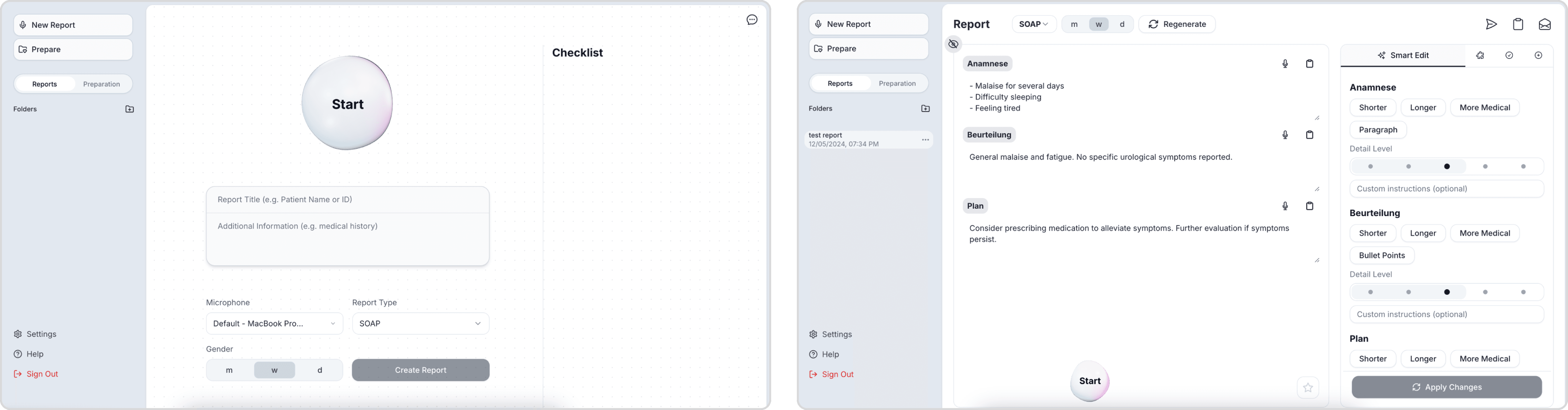
Wireframes
I created low-fidelity wireframes to explore layout changes, focusing on:
✺ Reducing visual clutter by collapsing menus
✺ Introducing progressive disclosure (only show what’s relevant per step)
✺ Creating clearer report input-output separation
Wireframes
I created low-fidelity wireframes to explore layout changes, focusing on:
✺ Reducing visual clutter by collapsing menus
✺ Introducing progressive disclosure (only show what’s relevant per step)
✺ Creating clearer report input-output separation
Wireframes
I created low-fidelity wireframes to explore layout changes, focusing on:
✺ Reducing visual clutter by collapsing menus
✺ Introducing progressive disclosure (only show what’s relevant per step)
✺ Creating clearer report input-output separation
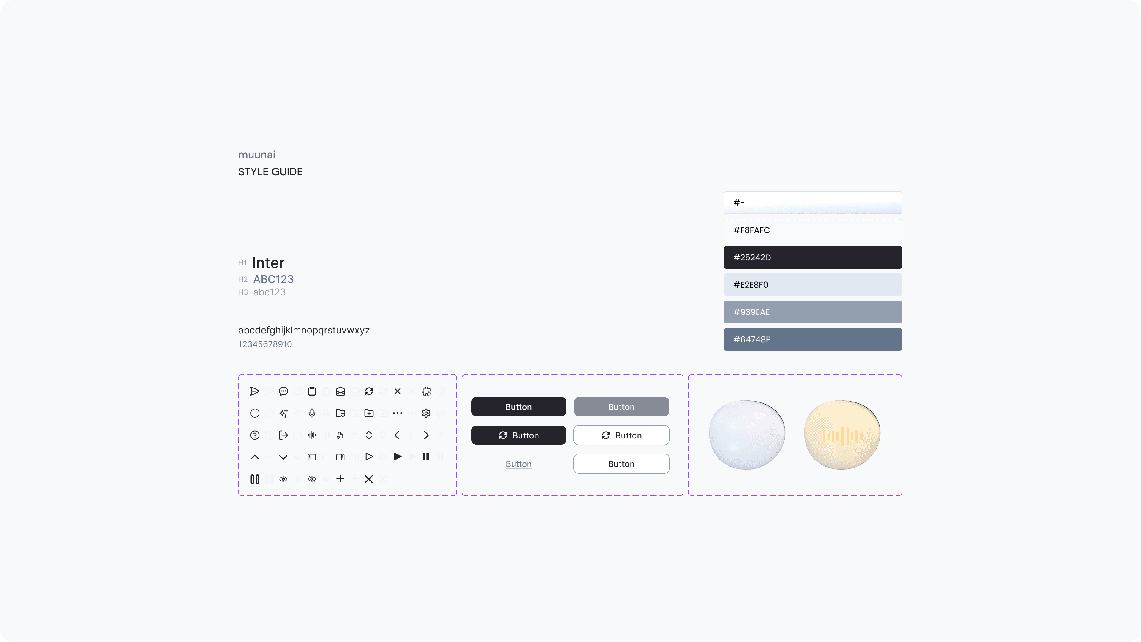
Visual identity
muunai didn’t have a formal design system
So I took initiative to create a basic component library, including button states, card styles, and form layouts, while keeping consistency with their existing color palette and typography.
Visual identity
muunai didn’t have a formal design system
So I took initiative to create a basic component library, including button states, card styles, and form layouts, while keeping consistency with their existing color palette and typography.
Visual identity
muunai didn’t have a formal design system
So I took initiative to create a basic component library, including button states, card styles, and form layouts, while keeping consistency with their existing color palette and typography.
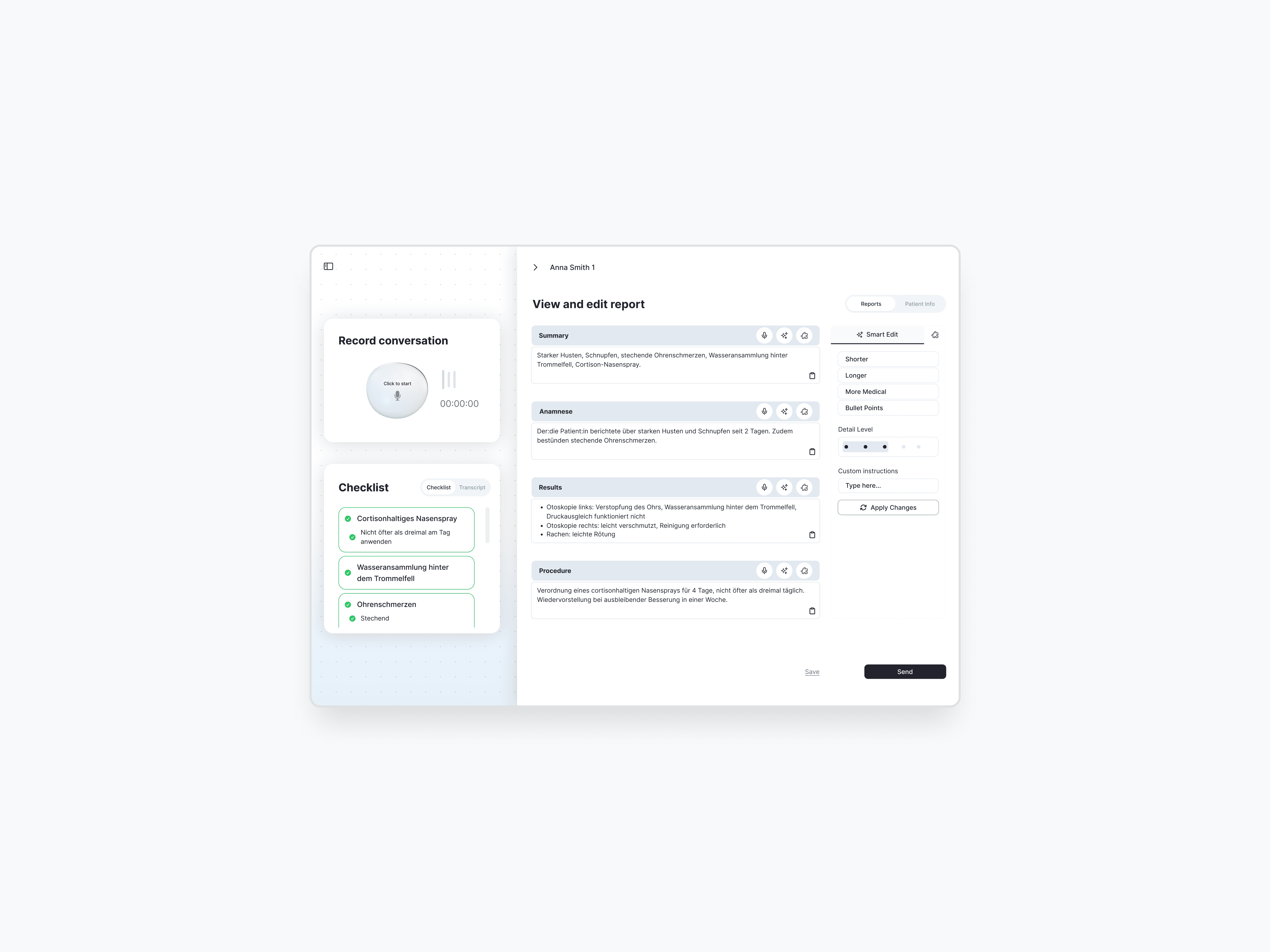
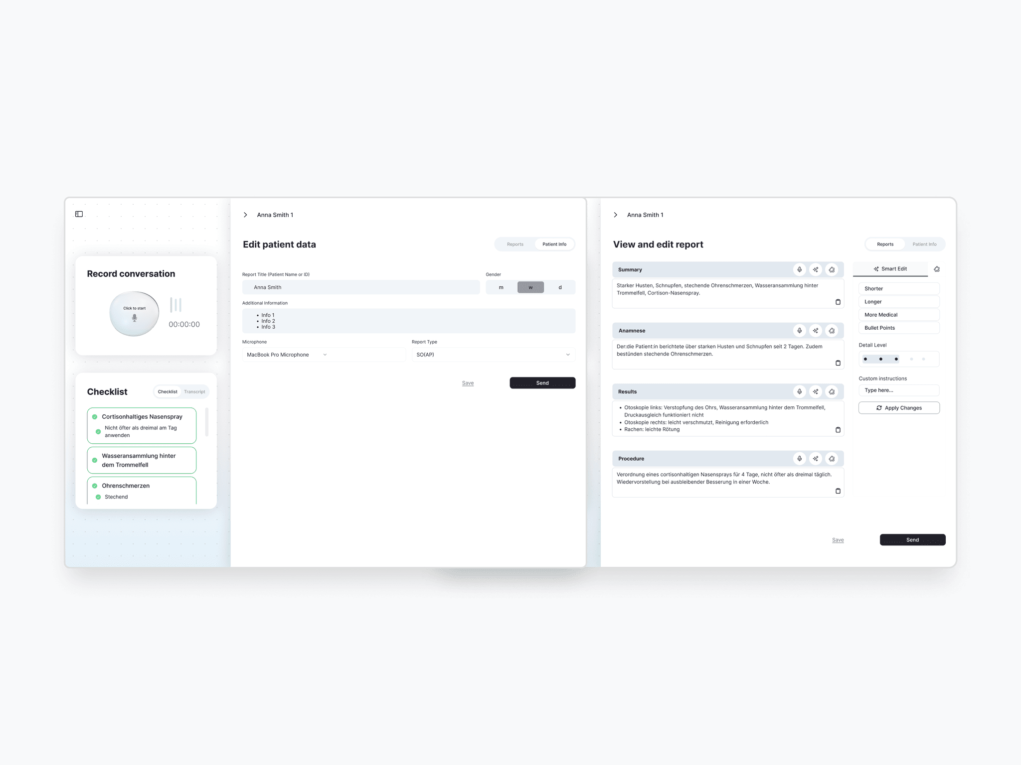
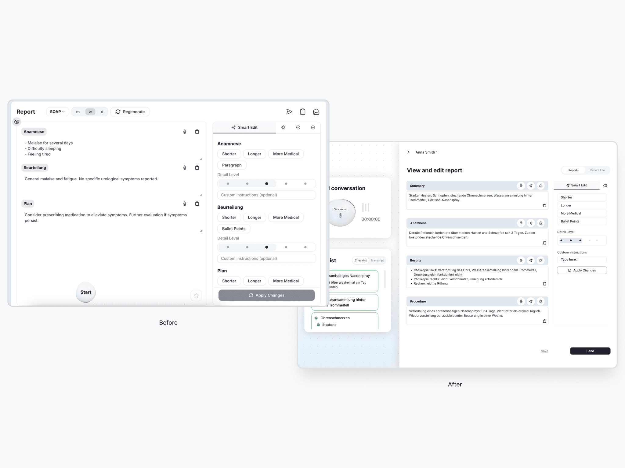
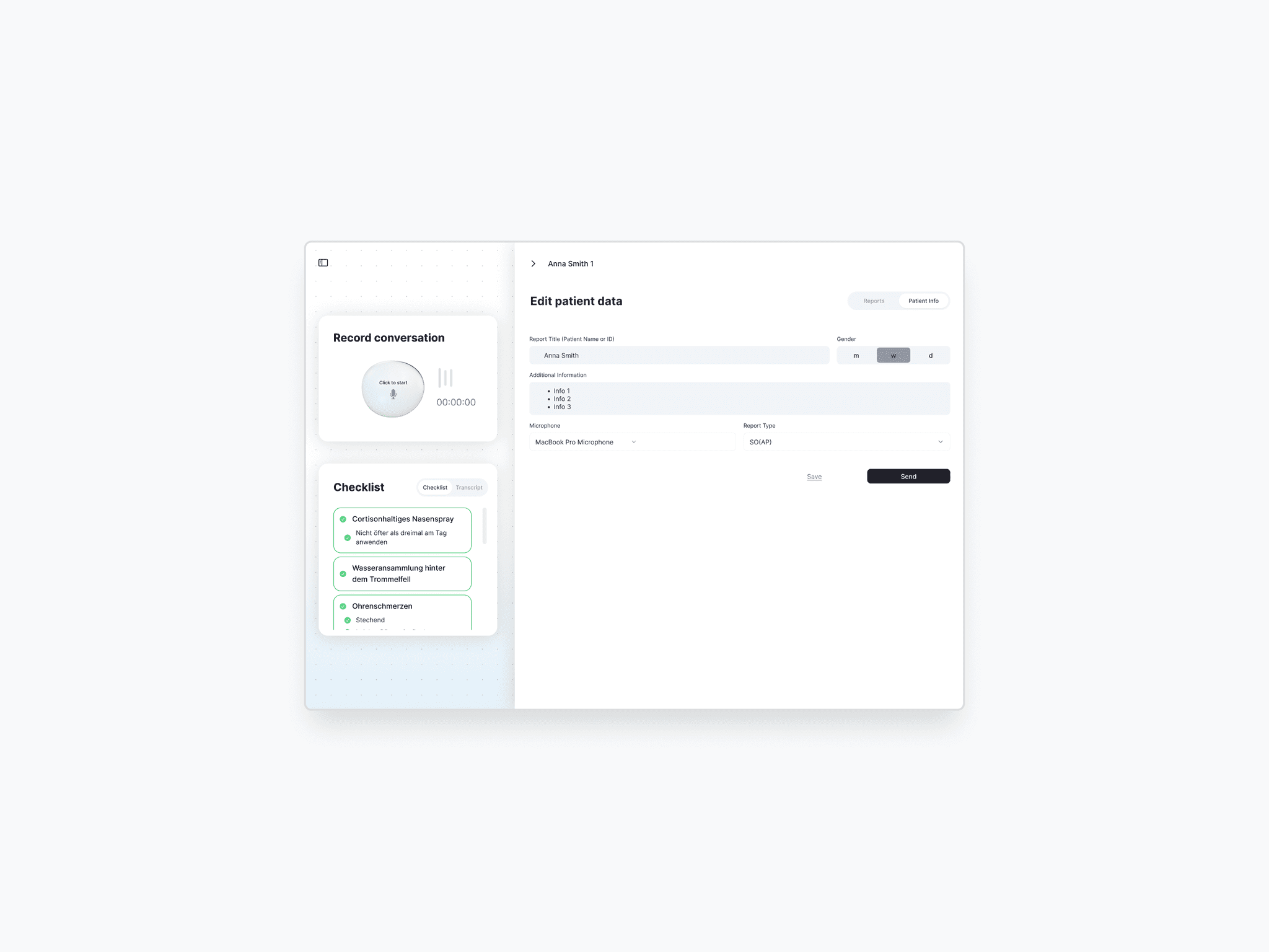
Solution
To address the usability issues we uncovered, I redesigned key parts of the reporting interface to be more intuitive, focused, and aligned with how doctors work
Solution
To address the usability issues we uncovered, I redesigned key parts of the reporting interface to be more intuitive, focused, and aligned with how doctors work
Solution
To address the usability issues we uncovered, I redesigned key parts of the reporting interface to be more intuitive, focused, and aligned with how doctors work
Structured report layout for clarity
I used clear section dividers to visually structure the report, making it easier for users to process information and move confidently through the workflow.
Structured report layout for clarity
I used clear section dividers to visually structure the report, making it easier for users to process information and move confidently through the workflow.
Structured report layout for clarity
I used clear section dividers to visually structure the report, making it easier for users to process information and move confidently through the workflow.
Smart Edit feature made intuitive
Smart Edit feature made intuitive
Smart Edit feature made intuitive
Clear finalization flow
Clear finalization flow
Clear finalization flow

Business values
While the design wasn’t implemented during our engagement, the redesign laid a solid foundation for stronger adoption, faster onboarding, and a more confident user experience
Business values
While the design wasn’t implemented during our engagement, the redesign laid a solid foundation for stronger adoption, faster onboarding, and a more confident user experience
Business values
While the design wasn’t implemented during our engagement, the redesign laid a solid foundation for stronger adoption, faster onboarding, and a more confident user experience
Onboarding feels simpler
Reorganized navigation helps new users quickly understand the workflow.
Onboarding feels simpler
Reorganized navigation helps new users quickly understand the workflow.
Onboarding feels simpler
Reorganized navigation helps new users quickly understand the workflow.
Workflow becomes faster
Workflow becomes faster
Workflow becomes faster
Actions feel more trustworthy
Actions feel more trustworthy
Actions feel more trustworthy
Limitations
Just like any UX project, we also faced some challenges and limitations:
Limitations
Just like any UX project, we also faced some challenges and limitations:
Limitations
Just like any UX project, we also faced some challenges and limitations:
Small sample size
Our research involved only three participants, who are medical students. Their perceptions and the way they approached the interface might be different from actual doctors. Additional usability testing with this group could help validate our solutions further.
Small sample size
Our research involved only three participants, who are medical students. Their perceptions and the way they approached the interface might be different from actual doctors. Additional usability testing with this group could help validate our solutions further.
Small sample size
Our research involved only three participants, who are medical students. Their perceptions and the way they approached the interface might be different from actual doctors. Additional usability testing with this group could help validate our solutions further.
Limited time
Limited time
Limited time