Women in CS
@Technical University Munich
Redesigned the website for a student-led organization to create a more intuitive and inclusive platform to attract new members, highlight events, and improve communication
Role
UX/UI Designer
Team size
2 Members
Timeline
May — July 2024
skills
UX Research
Usability Testing
Introduction
Women in CS @TUM
Women in CS@TUM is a student organization at the Technical University of Munich advocating for equal participation and support for women and other underrepresented groups in computer science. The team approached TUdesign for help modernizing their website, which they felt no longer reflected their values or engaged visitors effectively.
The goal was to improve the website’s usability, navigation, and visual identity, making it easier for students to learn about the organization, sign up for events, and get involved.
Problem
Some of the main reasons users did not complete their journey on the website
Problem
Some of the main reasons users did not complete their journey on the website
Problem
Some of the main reasons users did not complete their journey on the website
Underwhelming visual identity
Lacks visual elements to distinguish it from other student clubs
Lack of direct communication
No easy way for interested students to engage with the club
Unclear navigation
Lack of immediate access to events from other pages
The site was functional but underwhelming, too plain to capture attention, and missing several key pages that could convert passive visitors into active members.
Addressing these usability gaps would not only make the site easier to navigate but also help the organization attract new members and increase event participation, which ultimately strengthens engagement with their community.
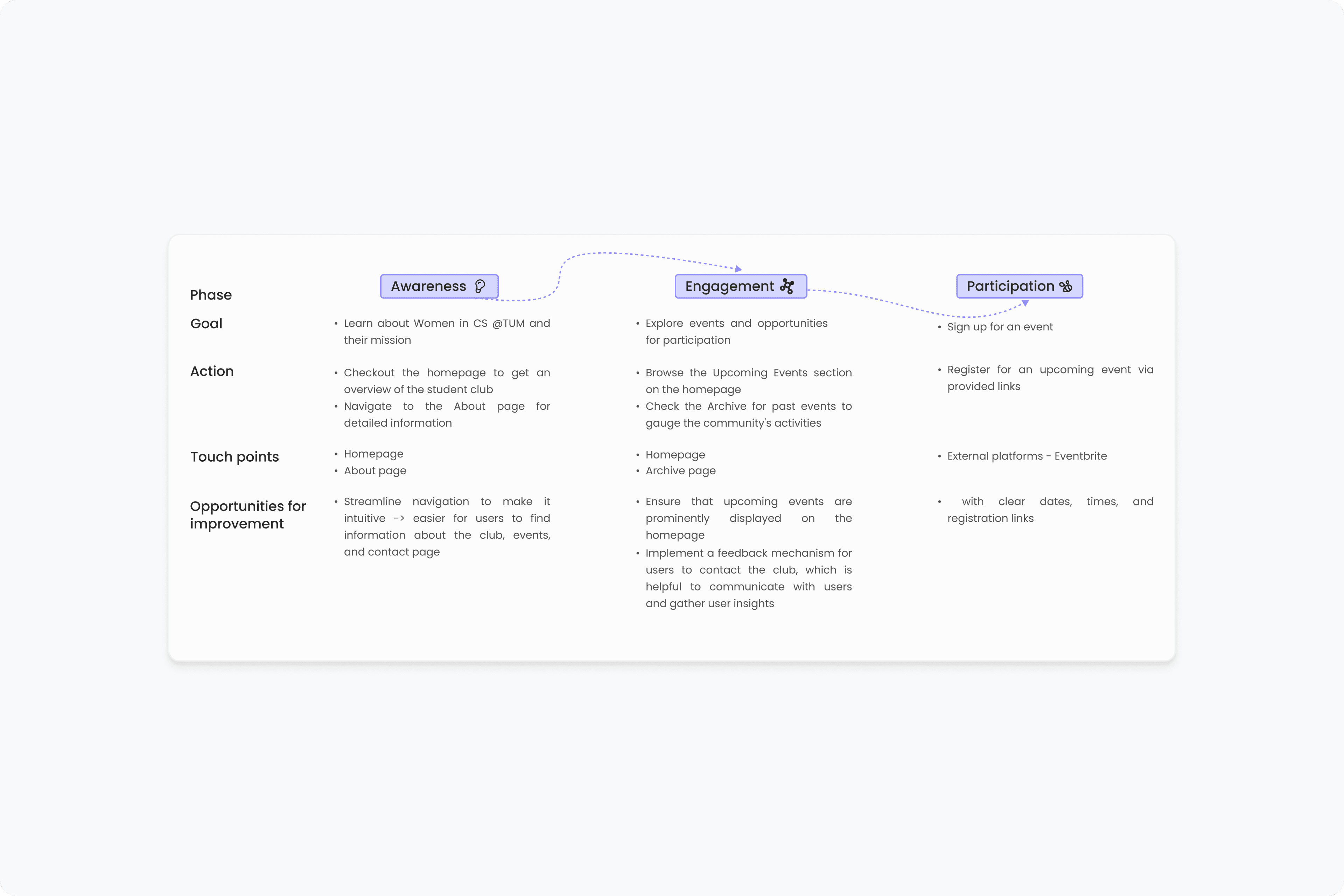
Research
I created a user journey map to better understand how a prospective student interacts with the site
The journey map shows step by step how users might explore the website. This helped highlight points of friction, particularly around event discovery and communication.
Research
I created a user journey map to better understand how a prospective student interacts with the site
The journey map shows step by step how users might explore the website. This helped highlight points of friction, particularly around event discovery and communication.
Research
I created a user journey map to better understand how a prospective student interacts with the site
The journey map shows step by step how users might explore the website. This helped highlight points of friction, particularly around event discovery and communication.
Information architecture
I also restructured the information architecture to prioritize clarity
This included adding dedicated pages for events and contact, and consolidating the About and Members content into a single, streamlined page.
Information architecture
I also restructured the information architecture to prioritize clarity
This included adding dedicated pages for events and contact, and consolidating the About and Members content into a single, streamlined page.
Information architecture
I also restructured the information architecture to prioritize clarity
This included adding dedicated pages for events and contact, and consolidating the About and Members content into a single, streamlined page.

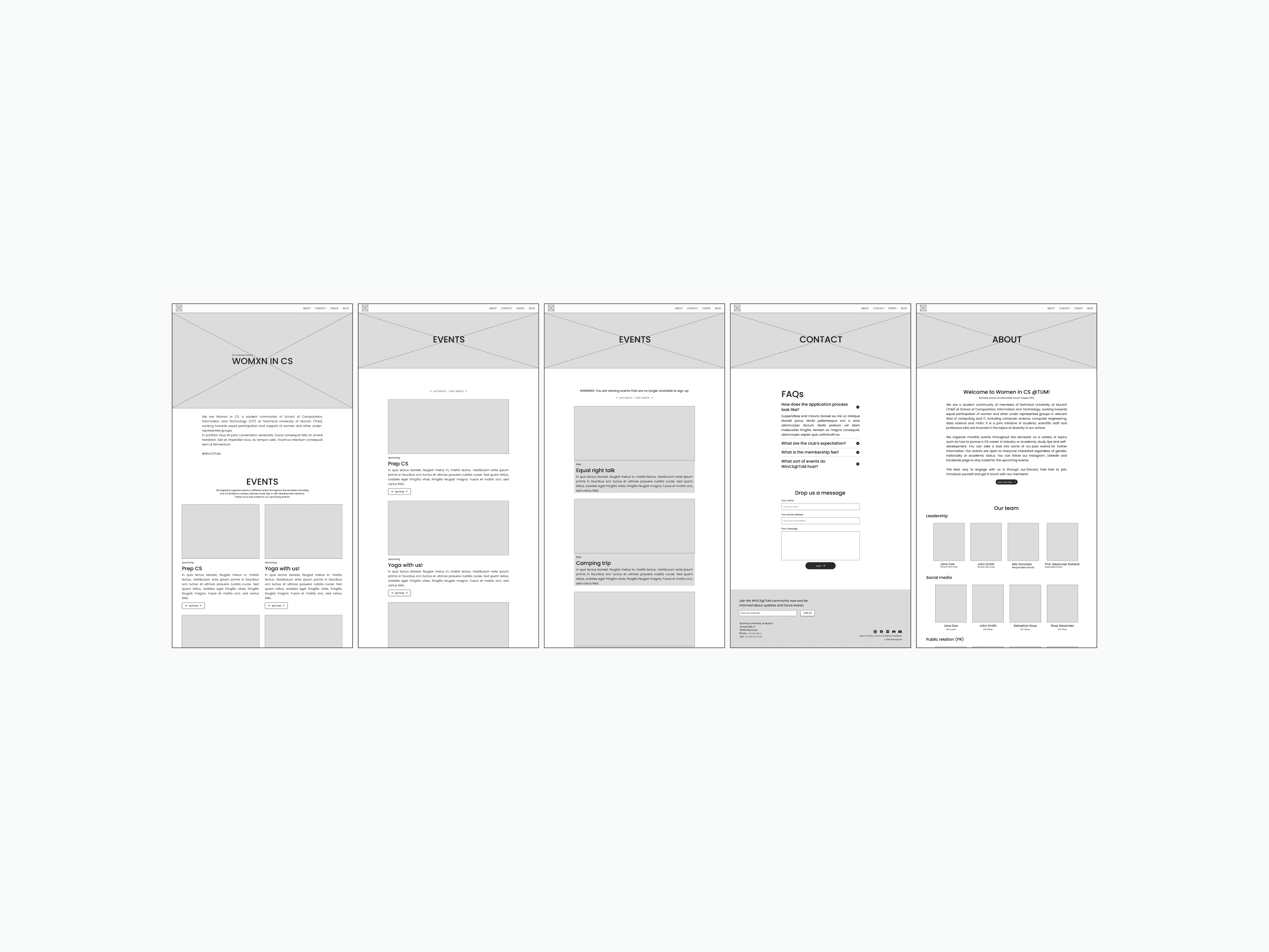
Ideation
With the IA defined, I began wireframing the new experience
In my wireframes, I prioritized ease of access by ensuring that key content, such as upcoming events, FAQs, and contact options, was accessible from anywhere via the navigation bar.
I added two new pages:
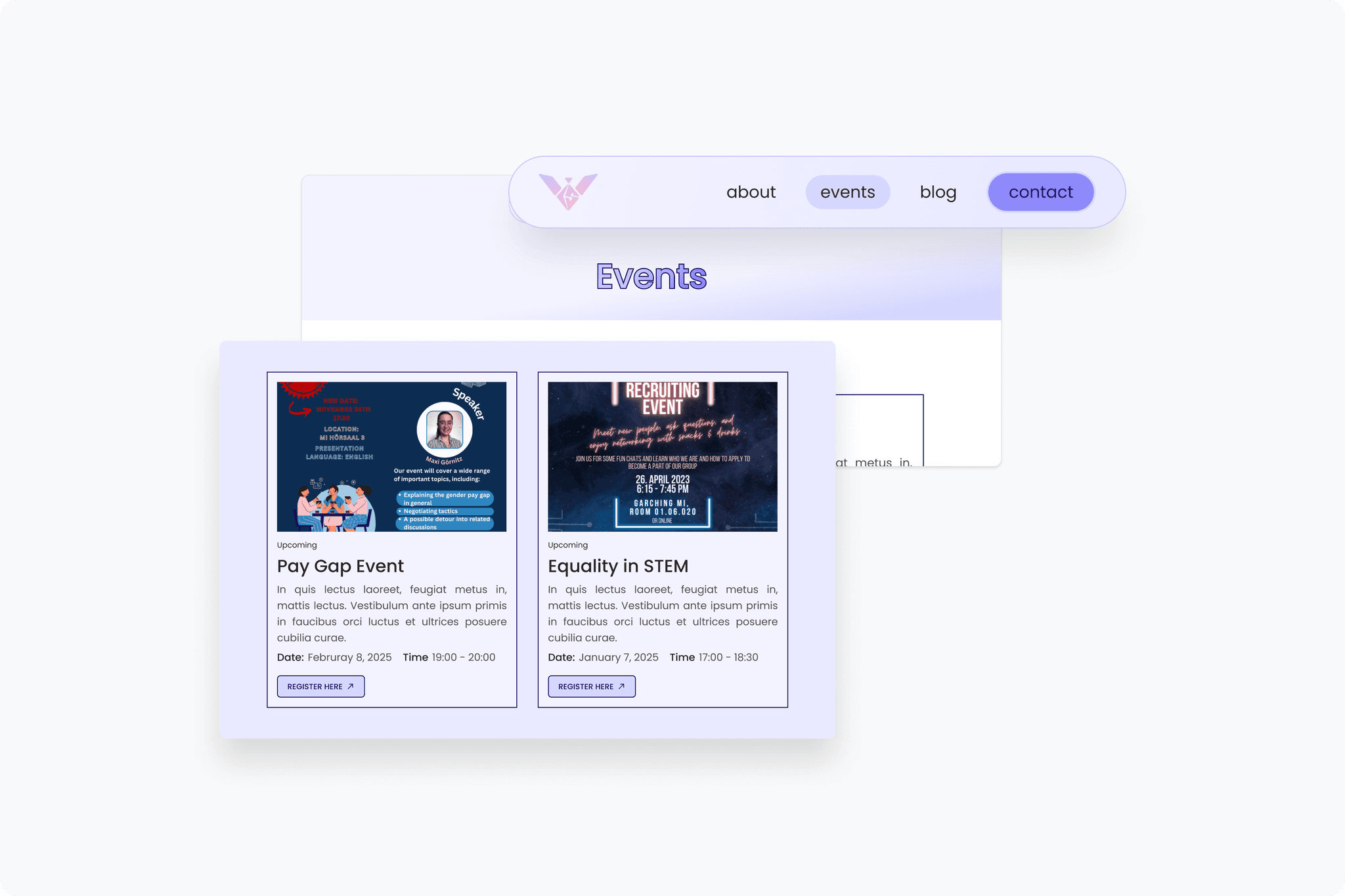
✺ An Events page that splits upcoming and past events into dedicated sections
✺ A Contact page that included a form and an FAQ section to streamline communication
I kept the structure simple, using a clear hierarchy and strong visual grouping to make scanning easier.
Ideation
With the IA defined, I began wireframing the new experience
In my wireframes, I prioritized ease of access by ensuring that key content, such as upcoming events, FAQs, and contact options, was accessible from anywhere via the navigation bar.
I added two new pages:
✺ An Events page that splits upcoming and past events into dedicated sections
✺ A Contact page that included a form and an FAQ section to streamline communication
I kept the structure simple, using a clear hierarchy and strong visual grouping to make scanning easier.
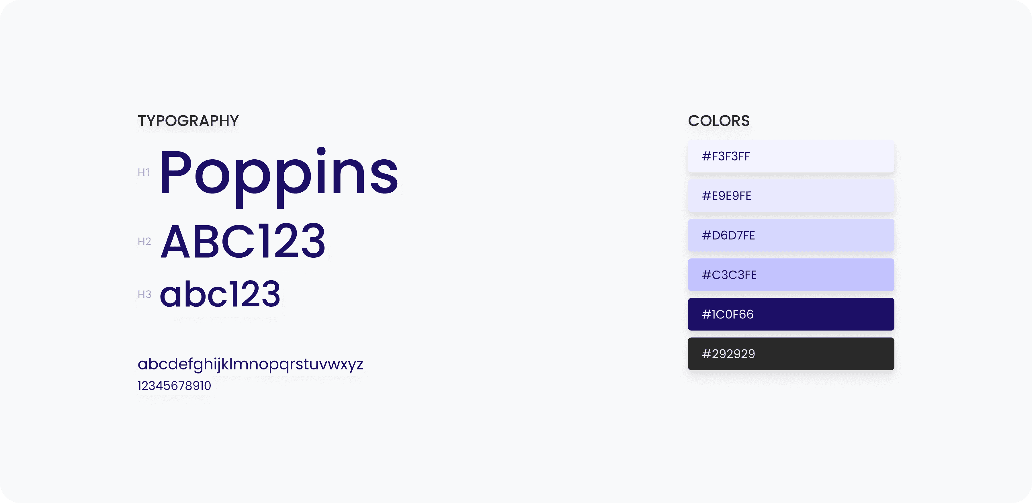
Visual identity
To express the organization’s identity, I introduced a bold purple as the primary brand color, chosen for its associations with empowerment, creativity, and inclusion
I created a simple visual system with consistent heading hierarchy, button styles, and card layouts, helping the site feel unified without overcomplication.
Testing & iteration
I tested the first iteration with four users, focusing on navigation clarity and event discovery
Feedback was encouraging overall, with users calling the design “clean” and “inviting.” However, one consistent suggestion was to remove the Past Events page, as most users were only interested in what's coming next.
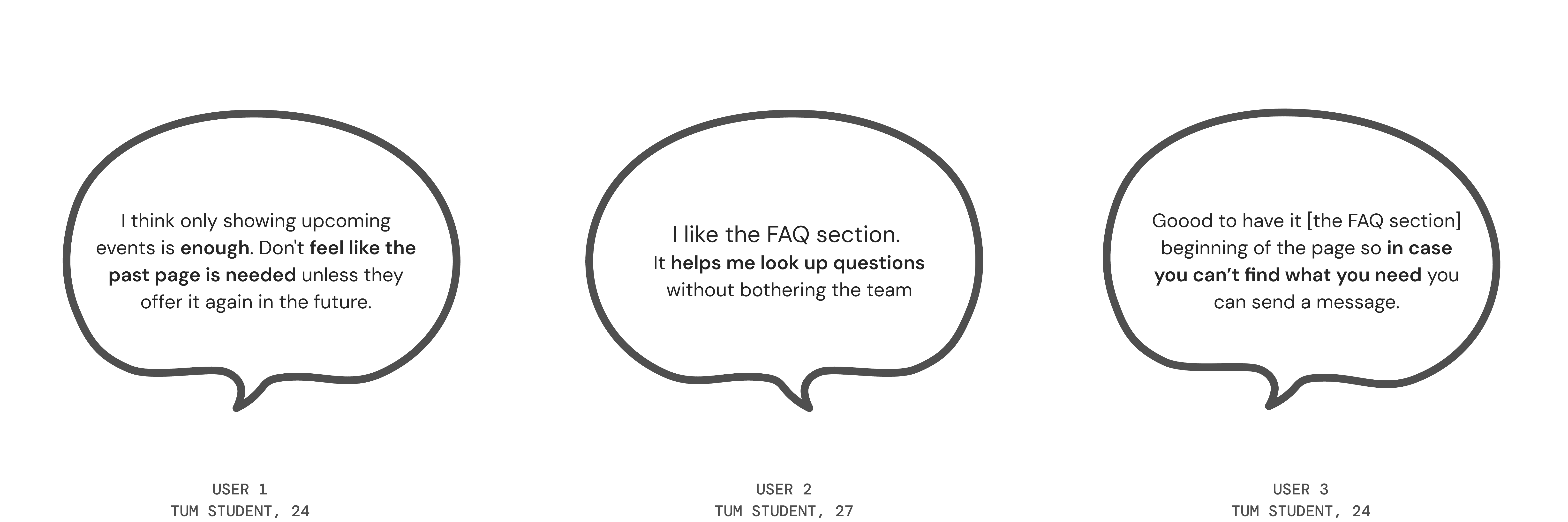
Iteration
Based on this feedback, I removed the Past Events section and surfaced only current and upcoming events, making the content more relevant and easier to scan.
Iteration
Based on this feedback, I removed the Past Events section and surfaced only current and upcoming events, making the content more relevant and easier to scan.
Iteration
Based on this feedback, I removed the Past Events section and surfaced only current and upcoming events, making the content more relevant and easier to scan.
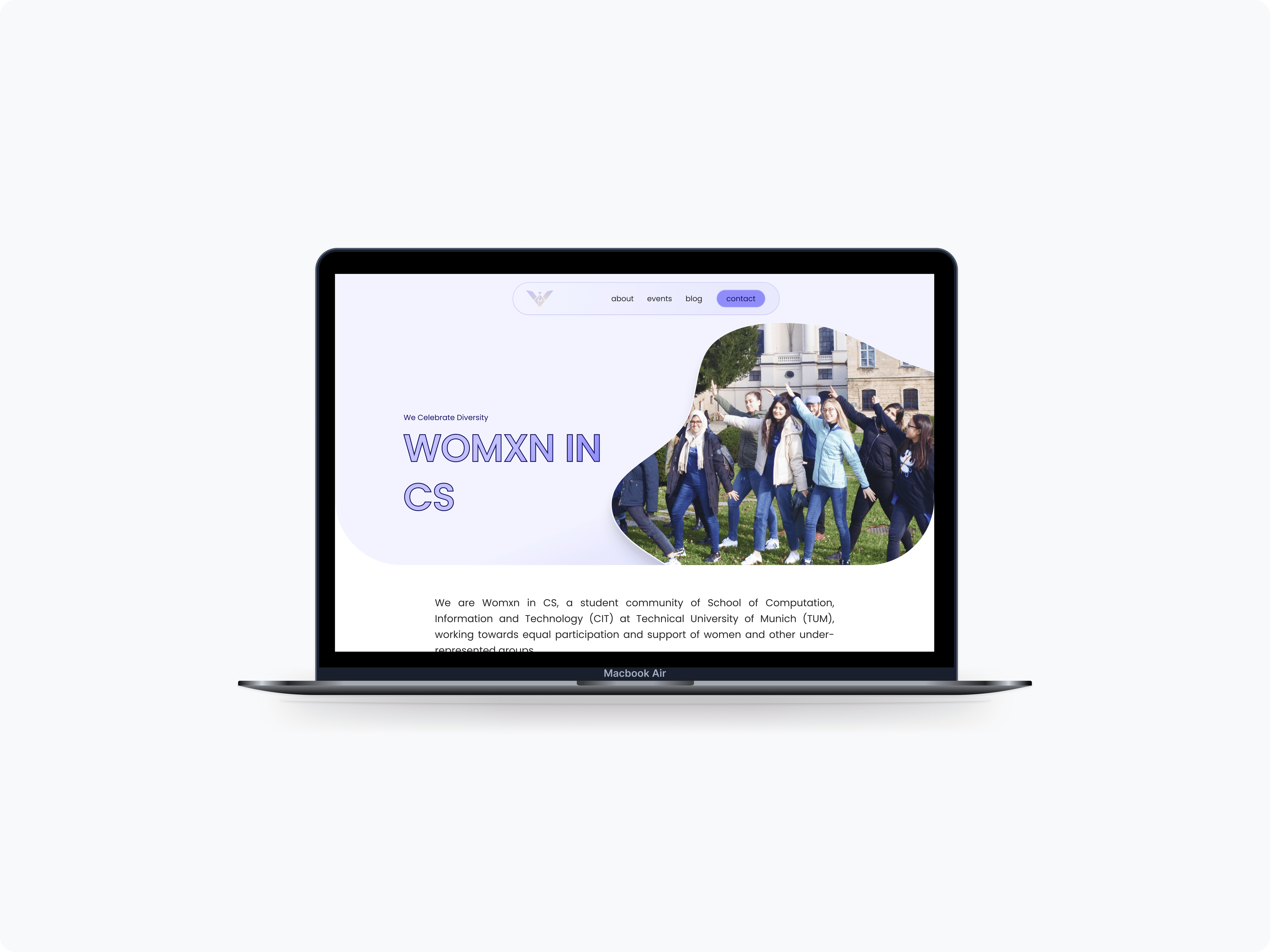
Final design
Some of the key improvements I introduced:
Final design
Some of the key improvements I introduced:
Final design
Some of the key improvements I introduced:
Streamlined navigation
I reorganized the navbar and added dedicated pages for Events and Contact. On the homepage, I replaced long event lists with rows of cards to improve scannability.
Streamlined navigation
I reorganized the navbar and added dedicated pages for Events and Contact. On the homepage, I replaced long event lists with rows of cards to improve scannability.
Streamlined navigation
I reorganized the navbar and added dedicated pages for Events and Contact. On the homepage, I replaced long event lists with rows of cards to improve scannability.
Refined content structure
Refined content structure
Refined content structure
Made it easier for users to get in touch
Made it easier for users to get in touch
Made it easier for users to get in touch


Reflection
This project helped me build confidence in leading a UX process from start to finish, while collaborating closely with another designer
I learned how to organize content based on how users actually explore websites, iterate quickly based on feedback, and design a visual system that reflects the organization’s brand and values.
While the final design wasn’t implemented, the experience taught me the value of research-driven iteration and designing for both clarity and character.
Next steps
✺ Conduct usability testing with real users to gather feedback for future iterations.
✺ Explore implementation with no-code tools for a potential pilot version.
✺ Track key metrics to measure the redesign’s effectiveness.
✺ Gather analytics if launched to validate user flows
✺ Add responsiveness and accessibility enhancements.